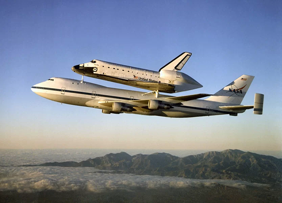
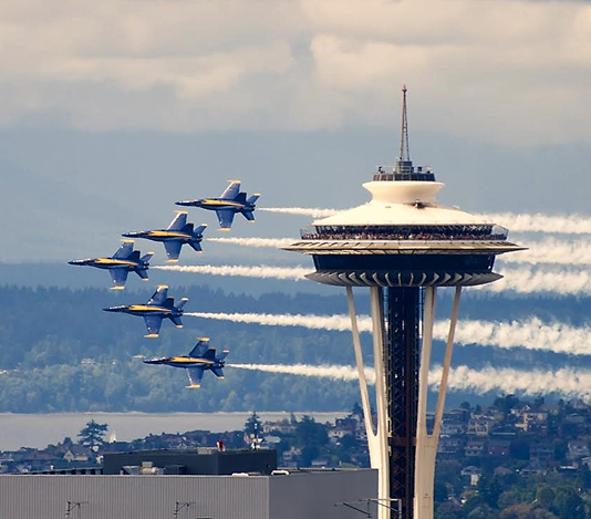
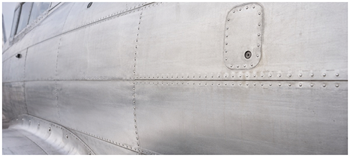
The Museum of Flight

The Museum of Flight.

An identity redesign for a Seattle institution that holds 130 aircraft and 60 years of aviation history.

Client · The Museum of Flight · Seattle

Nico Zhang · HCDE 308 · June 2026

Continue

01 · Brand overview

A museum brand built around motion, memory, and public wonder.

The Museum of Flight is the largest independent non-profit air and space museum in the world, founded in 1965 at Boeing Field, and the scale of what it holds is part of what the identity has to carry. There are more than 130 aircraft and spacecraft, tens of thousands of artifacts, and a collection that runs from early gliders through jet-age commercial aviation to the Space Shuttle program, alongside the personal histories of the pilots, engineers, and astronauts who are harder to put on a wall but matter just as much.

Audience

Families and visitors

Audience

Aviation enthusiasts

Audience

Students and educators

Audience

Donors, partners, and civic audiences

02 · Brand attributes

Four words the system is built around.

ATR.01

Elevated

A sense of ascent and movement, the feeling that something is about to leave the ground.

ATR.02

Trustworthy

Institutional clarity for the archives, the education work, and the stewardship the museum is responsible for.

ATR.03

Accessible

Open enough for families and first-time visitors without ever talking down to anyone.

ATR.04

Contemporary

A system that can live in digital and physical contexts at once, without looking like it is chasing either.

03 · Visual context

Where the system can lean, and where it should not.

Aviation museums

Most of them lean on heritage, large-scale photography, and dense interpretive panels, and the register ends up respectful and slightly archival, which reads as serious but rarely as alive.

Science centers

These go bright and primary-colored and family-first, often loud in the way they compete for the attention of children and school groups, which works for them but would pull this museum toward a younger register than it wants.

Airlines and aerospace

Here the language is sky-blue gradients, motion blur, and glossy metallic finishes, tuned for selling tickets and signaling trust, with very little room left for an institutional voice.

The goal that comes out of this is to keep the lift and motion of flight while making the system read as more editorial and more like a museum, through EB Garamond, generous white space, and color used with restraint rather than for effect.

04 · Design intent

The identity should make the engineering marvels of flight feel close and personal while staying quiet enough for the actual aircraft, stories, and hangars to lead.

Wonder without forcing spectacle.

Heritage without feeling old or distant.

A mark that survives small size, monochrome, signage, print, merchandise, and motion.

05 · Design philosophy

Three values, weighed against each other.

Wonder

Wonder is the easiest of the three to name and the hardest to actually design for, because the moment an identity tries to perform awe it usually undercuts it. What I keep coming back to is that the artifacts and the hangars already carry the feeling, and the system mostly has to not get in their way.

Heritage

The museum holds aircraft, engineering, stories, and the people behind them, which is a heavier kind of history than most brands have to account for. The identity has to respect that without letting it tip into something old or distant, and most of that work happens in restraint rather than in obvious references to the past.

Accessibility

The system has to hold up across signage, web, print, and merchandise, which means the mark has to survive small, monochrome, and in motion before it earns the right to become elaborate. That order matters to me, the constraints first and the flourishes only after, because a mark that only works large and full color has not really been designed yet.

06 · Moodboard

Six references that set the visual range.

Riveted aluminum aircraft skin showing rows of flush rivets.
01 Riveted aluminum aircraft skin: aviation history, engineering, and tactile authenticity.
Reflective aircraft nose form.
02 Aircraft nose form: streamlined geometry and a reflective museum-artifact quality.
Shuttle carrier aircraft lifting the space shuttle.
03 Shuttle carrier aircraft: lift, scale, discovery, and iconic aerospace memory.
Blue Angels in close formation.
04 Blue Angels formation: coordinated motion, speed, and public spectacle.
NASA Hubble homepage screenshot.
05 NASA and Hubble homepage: bold hero imagery and accessible science storytelling.
Detail of a metal panel showing scratches and rivets.
06 Metal panel detail: a silver-gray palette and aircraft construction language.

07 · Identity system

Mark, palette, type.

The Museum of Flight The Museum of Flight

Three aerodynamic shapes, the aircraft, the wing movement, and the takeoff, set against the wordmark in EB Garamond Bold. The mark is sized to read at embroidery scale first and to survive at building signage scale second, because the small end is where most marks quietly fail.

Palette

Primary

#0141C9

RGB 01 · 65 · 201

Secondary

#49A7F7

RGB 73 · 167 · 247

Neutral

#D1D1D1

RGB 209 · 209 · 209

Accent

#FF510A

RGB 255 · 81 · 10

The accent is a warm counter to the institutional blue, not a fourth brand color. It marks the small orientation cues: the section indices, today's date, the keyboard focus, and the ADMIT ONE grant on a ticket. It appears only as a small graphic mark, never as body text. Everywhere else, color stays restrained.

Type

Wordmark · EB Garamond Bold

The Museum of Flight

Editorial · EB Garamond Italic

Open daily, ten to five.

Body · EB Garamond Regular

General admission, exhibits, and experiences for one day of your choosing.

Identity system · decisions

Every decision is a system rule.

Each choice is made for the system, not one artifact, written as the decision, the reasoning behind it, and how it carries to artifacts this project never built.

One mark, scaled only by enlargement

The three shapes hold their relationship only while the proportions stay fixed, and squashing the lockup collapses the takeoff motion almost immediately.

Across future artifactsthe same mark survives a 12 mm embroidered pin, a printed banner, and a hangar sign meters wide, and distortion is never the lever.

One typeface family

EB Garamond carries institutional weight and editorial register at once, so the system never has to reach for a second face.

Across future artifactssignage, app UI, print, and email shift weight and style but add no typeface, keeping the system recognizable far from this prototype.

Blue, deliberately held back

The moment the secondary blue spreads past hover, focus, and the member-pass status pill, the identity starts to read as an airline rather than a museum.

Across future artifactsevery future surface inherits the same restraint, which is most of what keeps the system in the museum category.

Orange marks the one thing to notice

A warm accent marks orientation, where you are and what is current, which is work the blue cannot do at contrast.

Across future artifactssection indices, today, and keyboard focus on screen extend to the admission grant on a ticket and to entry and exit markers on signage, always as a small graphic mark.

Color scaled to durability

An artifact read once and discarded earns less color than one that is kept and reused.

Across future artifactsa temporary placard stays primary-only, while a member pass or an architectural sign that persists may carry more.

Editorial over technical

Between the editorial and the brutalist directions, the editorial one stays quiet enough for the aircraft to lead.

Across future artifactsnarrative contexts get restraint, while data-dense contexts (a manifest, a schedule) earn more color distinction. That is a rule, not a one-off.

A shared layout vocabulary

Hairline rules, tracked-caps labels, calendar-style date grids, and hatched unavailable states are defined components, not one screen's styling.

Across future artifactsan email header, a merchandise tag, or a wayfinding divider all draw from the same set, so any new artifact reads as part of the identity on sight.

08 · Digital artifact

Application · Buy Tickets.

This artifact is a working SvelteKit prototype of the museum's ticket purchase flow, built and skinned in the chosen identity rather than mocked up as a static screen. It carries the system through four states on a single screen, the default empty state, the ticket-populated state, the closed-day disabled state, and the secure-checkout chrome, with animated transitions across the calendar, the ticket stepper, the order summary, and the add-on cards.

Working in motion turned out to be the harder test of the identity, harder than any still composition, because every transition is another place the system can fall apart. Inter has been replaced with EB Garamond, the navy CTA has shifted to #0141C9, the bone ground is now white, and the old MoF lettermark has been replaced with the new combination mark. The layout vocabulary stays from the previous iteration, the hairline rules, the tracked-caps labels, the hatched closed-day cells, the sticky order summary, so the change reads as a refinement rather than a rebuild.

Low-fidelity wireframe of the Buy Tickets layout: header, hero, date picker, and sticky order summary.
Low-fidelity, the screen reduced to its structure: header, hero, date picker, and the sticky order summary.
Screenshot of the Buy Tickets prototype in the new identity.
High-fidelity, the system inhabited, built in SvelteKit. Live at /buy-tickets
The brutalist manifest direction that was built and then set aside.

Two directions, one rule

Before the editorial flow I built a second, brutalist manifest direction on the same data. It carried more color distinction between elements, which suited a dense control panel but pulled the museum toward an engineering tool. The editorial direction won because it stays quiet enough for the aircraft to lead, and the choice became a system rule: narrative contexts get restraint, data-dense contexts earn more color distinction, the same logic that later kept the orange accent on wayfinding alone.

09 · Analog artifact

Application · Admission ticket.

The printed admission ticket and the member guest pass are the analog companion to the digital flow, the physical thing a visitor actually receives at the gate. Both carry the same vocabulary as the prototype, the hairline rules between sections, the tracked-caps labels, the calendar-style date treatment, so the visit holds together from the moment of purchase to the moment of entry.

The two designs test the system at two different scales of attention, since the general admission ticket is read once at entry and discarded while the member pass is kept and reused for a year. Both run on the same lockup and the same type system, and the only real divergence is one of attention, not color: both carry the warm accent on a single status mark, the ticket on its ADMIT ONE grant and the pass on its ACTIVE pill, while everything else stays the institutional blue.

General admission ticketMUSEUM OF FLIGHTEstablished 1965 · SeattleADMIT ONEGeneraladmission.TICKET NO.1965-0427LOCATIONBOEING FIELDENTRY TIME10:30 AMVALID FORONE DAYREF. 004VISIT DATE2026JUN18THE MUSEUM OF FLIGHT · SEATTLE
General admission ticket, read once at entry and then discarded, where the warm accent marks its ADMIT ONE grant.
Member guest passMUSEUM OF FLIGHTMember program · SeattleMEMBER & GUESTMemberpass.PASS NO.MP-2019-01188MEMBER SINCE2019MEMBERM. WatanabeADMITSMEMBER + 1REF. 188ACTIVEVALID THROUGH2026DEC31THE MUSEUM OF FLIGHT · SEATTLE
Member guest pass, kept and reused, where the ACTIVE status pill carries the warm accent, mirroring the ticket.

10 · What the system held

Where the system kept its shape.

The combination mark holds at both small embroidered scales and large signage as long as the three-shape geometry stays intact, which was the part I was least sure about going in. Squashing it horizontally collapses the takeoff motion almost immediately, and holding the proportions is what keeps the read, so the constraint turned out to be less about size than about never distorting the relationship between the shapes.

EB Garamond carries the institutional weight of the wordmark and the editorial register of the body copy at the same time, which is what lets a single family run the entire system, from the wordmark down through headlines, captions, ticket fields, and footer text. I kept expecting to need a second typeface somewhere and never actually did, which I am reading as a sign the system is more coherent than I assumed at the start.

Restraint on the secondary blue is most of what keeps the system reading as a museum rather than an airline, which is a thinner line than I expected. The moment that blue shows up anywhere past active states and the single status pill on the member pass, the whole thing slides toward a category I spent the project trying to stay out of, and I am still not sure the boundary holds at every scale. The one color I added past the blue and the red alert states is a single warm accent, kept to wayfinding, marking the section indices, today, and the keyboard-focus position, so it reads as the restraint extended rather than abandoned, doing work the blue could not do safely, since the old blue focus ring never cleared contrast.

11 · What is still open

What the next pass would have to answer.

The mobile version of the Buy Tickets prototype has not been built yet, and that is the gap I am least comfortable leaving, since most people who buy a ticket will do it on a phone. The production print specs for ticket stock and perforation still need to be drafted, and the system has not been tested on signage at architectural scale, where the three-shape geometry will have to be re-evaluated at distances measured in tens of meters rather than tens of centimeters. I do not yet know whether the mark that survives embroidery also survives being read from across a hangar, and that is the question I would want to answer next.

Appendix

Process, credits, and disclosures.

A.01 · Process

The moodboard, the generated logo prototypes, and the rounds the combination mark went through before it settled are kept in the project Figma board. Each round narrowed toward geometry that holds at small embroidered scales without losing the sense of lift.

Open the moodboard & logo iterations in Figma

A.02 · AI disclosure

All design judgment and decisions were made by humans (Nico Zhang and David Han), and every AI output was reviewed, approved, or redirected before it entered the work. AI was used in three roles:

  • Logo and visual concepts: the combination mark began as AI image generation by David Han (see A.03) and was then refined by hand into the final mark, and the source of those concepts is credited to David. The wordmark (Nico Zhang) was set by hand, with no AI involvement.
  • Prototype and case-study code: Claude Code (Anthropic). The SvelteKit Buy Tickets prototype and this case-study site were implemented by the code agent under direction, with every layout, state, and interaction specified, reviewed, and revised by the author.
  • Draft text and design options: Claude. Some captions and the placement of the wayfinding accent were proposed by the model and then judged, edited, or redirected by the author, though the contrasting-color brief and its two candidate values were the author's own.
  • What is hard to duplicate is the human judgment layer: the identity direction, the embroidery-first mark constraint, the single-typeface decision, and the enforced color restraint, all of which shaped and filtered everything the tools produced.

A.03 · Team contributions

David Han is credited with the combination mark (the three aerodynamic shapes) and with the shared brand work that preceded this case study, and my contribution to the logo was the wordmark and its typography. The identity system, the color and layout decisions, and the digital and analog artifacts shown here are my own work.

A.04 · Class feedback

For the Tuesday critique I presented two ticket-page directions: a minimal, editorial design and a brutalist airplane-manifest page. The room liked the extended use of color in the brutalist version but valued the professionalism of the minimal one. Holding both is what led to the fourth color, a single contrasting accent (#FF510A) added to the editorial system so it carries a little of the brutalist color life without giving up its restraint.

A.05 · Sources & references

Reference materials behind the research, moodboard, and type system.

  • Typeface: EB Garamond (Georg Duffner & Octavio Pardo, SIL Open Font License) via Google Fonts. The prototype mono and sans faces are JetBrains Mono and Inter, both from Google Fonts.
  • Museum facts: founded in 1965 at Boeing Field, the largest independent non-profit air and space museum in the world, with over 130 aircraft and spacecraft and tens of thousands of artifacts. Source: museumofflight.org/about (verified June 2026).
  • Moodboard references and the generated logo prototypes are collected in the project Figma board (linked below) and shown in section 06. Image sources are visible within the moodboard itself.
Moodboard & logo iterations (Figma)